- WOODIN
- BRAND
-
CI & BI

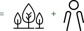
It's a combination of two words, which means that it provides a space where people co-exist with eco-friendly wood.
Woodin's corporate identity describes that it makes eco-friendly products which are harmless to human body.
Woodin's first
letter, W, expresses itself as a wellbeing company that makes eco-friendly green products.
The symbol which looks like a butterfly or an adorable person with two hands up represents Woodin's flexibility in creating a wide range of products,
multi-
functions and various designs.
Special cautions are required when Woodin’s symbol is modified and used because it might distort the image of the
Woodin and weaken the communication effect.


-
woodin

greenPANTONE 369 C
C66 M18 Y100 K5 -
woodin

blackPANTONE C
C0 M0 Y0 K100
-
woodin

deep greenC76 M40 Y75 K1
-
woodin

goldC20 M30 Y70 K15
-
woodin

fino colorC100 M35 Y50 K0
-
woodin

siverC0M0 Y0 K30
Horizontal form
Vertical form